Project Brief
Module :
Interaction Design 103 - Exploring Identity
Description :
Create a digital banking brand targeted at young people.
The primary goal of this UX project is to design and develop a user-centric banking platform under the brand Fortuna, catering specifically to the needs and preferences of younger adults and kids.
Fortuna, a new banking brand targeting younger adults and kids, seeks to revolutionize the banking experience by integrating modern technology, financial education, and accessibility. However, there's a gap in the market—traditional banks often lack appeal to this demographic due to their outdated interfaces, limited educational resources, and a lack of engagement with younger customers. The challenge lies in creating a banking platform that not only provides robust financial services but also engages, educates, and empowers younger generations to manage their finances responsibly and effectively.
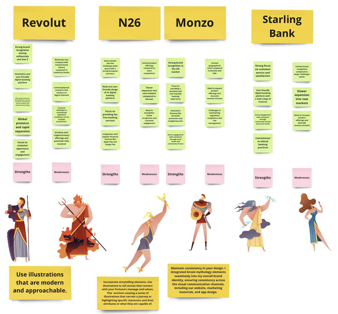
The banking industry is undergoing a significant transformation, with challenger banks like Revolut, N26, Monzo, and Starling Bank disrupting the traditional model. These challenger banks are leveraging technology to offer innovative and user-friendly banking experiences, appealing to younger, tech-savvy consumers.
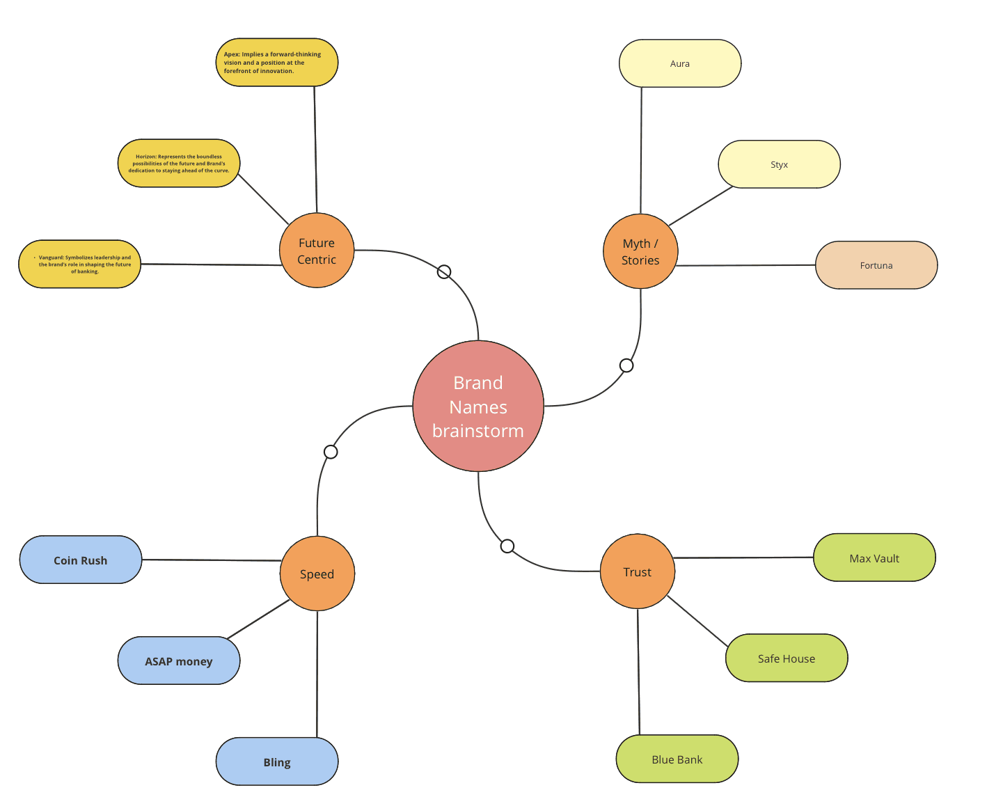
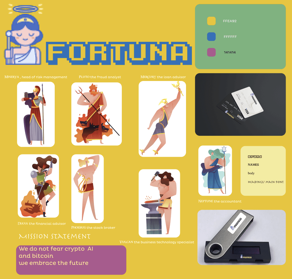
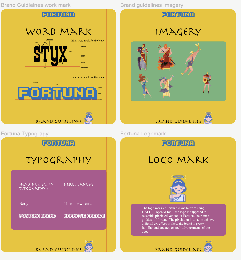
I think incorporating mythology and illustrative storytelling will attract youth to switch over to Fortuna.
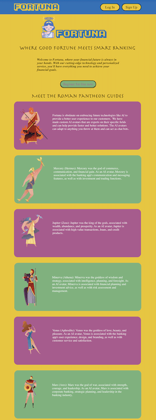
Each Roman god or goddess has unique characteristics and associations. I chose characters that align with my brand's core values and messaging. These Roman gods can act as AI avatars for the brand.
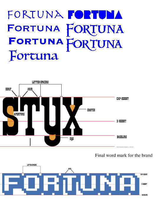
The main essence of this project were to create brand guidelines for the banking brand and I chose to centre around roman mythology as a guide for Fortuna's theme. After doing this project I understood the scope of what it takes to build a brand and I learned to appreciate even minute details matter when creating a brand. I think it achieved the problem I was trying to solve, to help young people learn the power of compound interest.
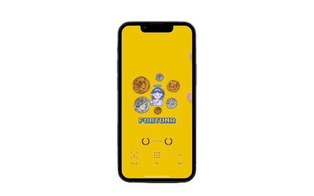
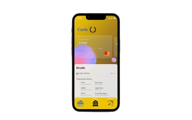
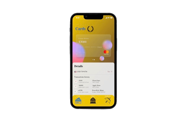
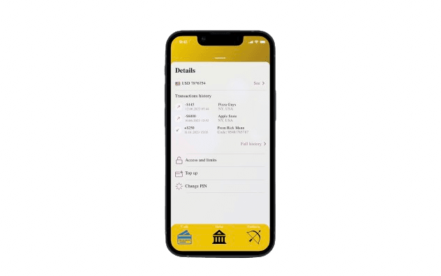
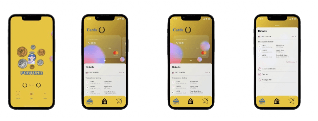
The banking app for Fortuna was designed to mimic the gold theme from ancient roman gold coins to establish a rustic ancient Rome vibes. the Icon sets uses Roman wreaths as an emblem , Silhouette of Pantheon as Home Screen button and Diana or Artemis's bow as a call to use other roman AI avatars for help.
Banking Made Fun and Accessible
Youthful Design & Intuitive Interface:
The landing page boasts a vibrant, user-friendly design tailored for younger audiences. The user is welcomed and introduced to Roman gods and goddesses who act as AI avatars for Fortuna and each of them have a unique attribute and specific skill set to tackle each of user's problems.
Accessible for All: Fortuna believes in inclusivity. The platform is designed to cater to various learning styles and accessibility needs, ensuring everyone can confidently manage their finances.
